Traffic signs
Car Show
Traffic signs
Circular highway shield | Gantry | Prohibitory traffic sign | Reassurance marker | Stop sign | Street sign theft | Variable message signs | Warning signs | Yield sign
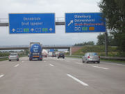 A German Autobahn overhead direction sign
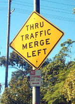 A
U.S. warning sign indicating that drivers who do not wish to exit
immediately should merge left, and a prohibitory No Stopping sign
Most countries erect signage, known as traffic signs or road signs,
at the side of roads to impart information to road users. Since language
differences can create barriers to understanding, international signs using
symbols in place of words have been developed in Europe and adopted in most
countries and areas of the world. Annexe 1 of the Vienna Convention on Road
Signs and Signals of November 8, 1968 defines eight
categories of signs:
- A. Danger
warning signs
- B.
Priority signs
- C.
Prohibitory or restrictive signs
- D. Mandatory signs
- E. Special regulation signs
- F. Information, facilities, or service signs
- G. Direction, position, or indication signs
- H. Additional panels
However, countries and areas categorise road signs in different ways. In the
U.S., the type, placement, and graphic standards of traffic signs and pavement
markings are legally regulated the Federal Highway Administration's Manual on
Uniform Traffic Control Devices is the standard.
History
The earliest road signs gave directions; for example, the
Romans erected stone columns throughout their empire giving the distance to
Rome. In the Middle Ages multidirectional signs at intersections became common, giving
directions to cities and towns.
Traffic signs became more important with the development of automobiles. The
basic patterns of most traffic signs were set at the
1908 International Road Congress in Rome. Since then there have been
considerable change. Today they are almost all metal rather than wood and are
coated with retroreflective sheetings of various types for nighttime and low-light
visibility.
New generations of traffic signs based on big electronic displays can also
change its symbols and also provide intelligent behavior by means of sensors or
by remote control. In this sense, "road beacons" or
RBS based in the use of RFID special transponders buried in the asphalt
arise as an innovative evolution for on-board signalling.
Yet another "medium" for transferring information ordinarily associated with
visible signs is
RIAS (Remote Infrared Audible Signage), e.g.
"Talking Signs®" for print-handicapped (including
blind/low-vision/illiterate) people. These are infra-red transmitters serving
the same purpose as the usual graphic signs when received by an appropriate
device such as a hand-held receiver or one built into a cell phone.
North America and Australia
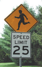 A
U.S. warning sign about children in the road, and a
speed
limit notice
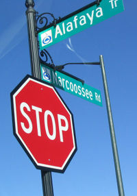 A reflective stop sign with a black background, and two reflective street signs with the
Orlando, Florida city logo.
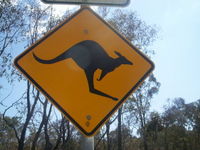 Yellow and black warning signs for
Kangaroos
are common in Australia.
Categorization
Regulatory signs
Warning signs
Guide signs
Route marker signs
Expressway signs
Freeway signs
Informational signs
Recreational and cultural interest signs
Emergency management (civil defense) signs
Temporary traffic control (construction or work zone) signs
School signs
Railroad and light rail signs
Bicycle signs
Colour schemes
The
North American colors and the Australian colours are normally significant as followed:
green with white letters for informational signs, such as directions,
distances, and places
brown with white for signs to parks, historic sites, ski areas, forests, and
campgrounds
blue with white for rest areas, food, gasoline or petrol, and lodging
white with red or black letters for regulatory signs, such as speed limits
or parking
yellow with black letters and symbols for warning signs, such as curves and
school zones
orange with black letters for temporary traffic control zones and detours
Regulatory signs are also sometimes seen with white letters on red or black
signs. In Quebec, the usage of blue and brown is reversed, and many
black-on-yellow signs are red-on-white instead. Many U.S. states now use
fluorescent orange for construction signs, and fluorescent yellow-green (FYG)
for school zone, crosswalk, pedestrian, and bicycle warning signs. Fluorescent
pink signs are sometimes used for incident management warning.
Highway symbols and markers
Every state and province has different markers for its own highways, but use
standard ones for all federal highways. Many special highways, such as the Queen
Elizabeth Way or Trans-Canada Highway, or originally on U.S. highways like the
Dixie Highway, have used unique signs. Counties in the U.S. sometimes use a
pentagon-shaped blue sign with yellow letters for numbered county roads, though
the use is inconsistent even within states.
Units
Most American road signs measure distances in
miles rather than kilometres although the US Department of Transportation has
developed metric standards for all signs. Traffic signs in the United States
have been standardised through the Manual on Uniform Traffic Control Devices (MUTCD), though they sometimes
still vary from state to state, particularly on older signs.
Languages
Signs in most of Canada, the U.S. and Australia are written in
English. Quebec uses French, while New Brunswick uses both English and French
and a number of other provinces such as Ontario and Manitoba use bilingual
French-English signs in certain localities. Mexico uses Spanish. Within a few
miles of the U.S.-Mexico border, road signs are often in English and Spanish.
Typefaces
The typefaces predominantly used on signs in the U.S. and Canada are the
FHWA alphabet series (Series B through Series F and Series E Modified). Details
of letter shape and spacing for these alphabet series are given in "Standard
Alphabets for Traffic Control Devices," first published by the Bureau of Public
Roads (BPR) in 1945 and subsequently updated by the Federal Highway
Administration (FHWA). It is now part of Standard Highway Signs (SHS), the companion volume to the MUTCD which gives
full design details for signfaces.
Initially, all of the alphabet series consisted of uppercase letters and
digits only, although lowercase extensions were provided for each alphabet
series in a 2002 revision of SHS. Current Series B through Series F evolved from
identically named alphabet series which were introduced in 1927.
Straight-stroke letters in the 1927 series were substantially similar to
their modern equivalents, but unrounded glyphs were used for letters such as B,
C, D, etc., to permit more uniform fabrication of signs by illiterate painters.
Various state highway departments and the federal BPR experimented with rounded
versions of these letters in the following two decades.
The modern, rounded alphabet series were finally standardised in 1945 after
rounded versions of some letters (with widths loosely appropriate for Series C
or D) were specified as an option in the 1935 MUTCD and draft versions of the
new typefaces had been used in 1942 for guide signs on the newly constructed
Pentagon road network.
The mixed-case alphabet now called Series E Modified, which is the standard
for destination legend on freeway guide signs, originally existed in two parts:
an all-uppercase Series E Modified, which was essentially similar to Series E
except for a larger stroke width, and a lowercase-only alphabet. Both parts were
developed by the California Division of Highways (now
Caltrans)
for use on freeways in 1948-50.
Initially the Division used all-uppercase Series E Modified for
button-reflectorized letters on ground-mounted signs and mixed-case legend
(lowercase letters with Series D capitals) for externally illuminated overhead
guide signs. Several Eastern turnpike authorities blended all-uppercase Series E
Modified with the lowercase alphabet for destination legends on their guide
signs.
Eventually this combination was accepted for destination legend in the first
manual for signing Interstate highways, which was published in 1958 by the
American Association of State Highway Officials (AASHO) and adopted as the
national standard by the BPR.
Uses of Non-FHWA Typefaces
The
National Park Service uses Clarendon, a serif typeface, for guide signage (typically, but not always, on a brown
background); some states also use Clarendon for recreational signage.
Georgia, in the past, used uppercase Series D with a custom lowercase
alphabet on its freeway guide signs; the most distinctive feature of this
typeface is the lack of a dot on lowercase 'i' and 'j'.[1]
More recent installations appear to include the dots.[2]
A new typeface family titled "Clearview"
has been developed by U.S. researchers in recent years to provide improved
legibility, and is currently permitted for light legend on dark backgrounds
under FHWA interim approval. Thus far, Clearview has only seen widespread use by
state departments of transportation in Michigan, Pennsylvania, and Texas.
It is common for local governments, airport authorities, and contractors to
fabricate traffic signs using typefaces other than the FHWA series; Arial and
Helvetica
are common choices.
Europe
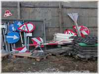 Temporary traffic signs usually used at
building sites
In 1968, the European countries signed the Vienna Convention on Road Traffic
treaty, the aim of which was to standardize traffic regulations in participating
countries in order to facilitate international road traffic and to increase road
safety. Part of the treaty was the Vienna Convention on Road Signs and Signals, which defined the traffic signs
and signals. As a result, in Western Europe the traffic signs are well standardised nowadays, although there are still some country-specific exceptions
in many countries, mostly dating from the pre-1968 era. The convention has been
adapted to allow variations when countries weren't expected to follow the main
standard.
The basic principle of the European traffic sign standard is that usage of
certain shapes and colours are to be used systematically for indicating same
purposes. Triangular shapes (white or yellow background) are used in warning
signs. Additionally, the Vienna convention allows an alternative shape for
warning signs, a diamond shape, which is rarely used in Europe. The prohibition
signs in Europe are round with a red border. Informative and various other
secondary signs are of rectangular shape. With the animal warning signs, one can
notice national flavour quite often, (moose, frog, deer, cow etc.), and the
convention allows any animal to be used.
Directional signs have not been harmonised under the Convention, at least not
on ordinary roads. As a result, there are substantial differences in directional
signage throughout Europe. Differences apply in typeface, type of arrows and,
most notably, colour scheme. The convention however specifies a difference
between motorways and ordinary roads, and that the motorways to have
white-on-green (e.g. Italy, Switzerland, Sweden) or white-on-blue (e.g. Germany,
France, UK).
Differences are larger for non-motorways: red-on-white in Denmark,
white-on-blue in Italy, Sweden and Switzerland and black-on-yellow in Germany,
Luxembourg and Norway. Other nations split among the non-motorways. In France
and the UK,
primary roads are signposted in white-on-green and other roads go in
black-on-white.
Signposting road numbers differs greatly as well. Only
European route number, if signposted, will always be placed in white letters
on a green rectangle.
European countries use the metric system on road signs (distances in
kilometres or metres, heights/widths in metres) with the notable exception of
the
UK, where distances are still indicated in
miles. For countries driving on the left, the convention stipulates that the
traffic signs should be mirror images of those used in countries driving on the
right. This practice, however, is not systematically followed in the two
European countries driving on the left, Ireland and the United Kingdom. The
convention permits the usage of two background colours for commonly used signs
with a light background, white or yellow. Most countries use white with a few
exceptions like Sweden and Finland, for
instance, where the yellow colour was chosen.
United Kingdom
Traffic signing in the UK conforms broadly to European norms, though a number
of signs are unique to Britain and direction signs omit
European route numbers. The standards governing the system remained of an
advisory nature until 1933 when regulations for traffic signs were published
under powers created by the Road Traffic Act 1930. In the late 1950s and early
1960s, the system currently in use was developed by the Anderson Committee,
which established the motorway
signing system, and by the Worboys Committee, which reformed signing for
existing all-purpose roads.
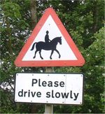 UK roadsign warning of horses and riders ahead
The document governing traffic signing in Britain is the Traffic Signs
Regulations and General Directions (TSRGD). The current signing system was
introduced on 1 January 1965. Britain remains the only
European Union member nation to use Imperial measurements for distance and speed, although metric authorised-mass
signs were prescribed in 1981 and there is now a dual-unit (imperial first)
option for clearance signing.
Three separate colour schemes exist for direction signs. A road may be a
motorway (white on blue), a primary route (white on dark green with yellow route
numbers), or a non-primary route (black on white). Most trunk roads,
which carry most of the automobile traffic and are owned by central government,
and some local authority principal routes are signed as primary routes.
Guildford Rules
A system called the Guildford Rules is used to put directional
information pertaining to routes of different class on patches coloured
appropriately for those classes on direction signs. This patching system was
developed in the mid-1980s as part of an effort to eliminate sign clutter and
receives its name from the town of Guildford, Surrey, where
the experimental signs were placed.
Example directional sign
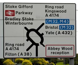 A road sign near Bristol.
The direction sign is patched according to the Guildford Rules. It gives
directions to (Bristol) Parkway railway station (red
British Rail symbol), motorways (blue-background patches), and towns reached via
non-primary A-roads. Red-edged patches and red-bordered signs are used for
military establishments (the Ministry of Defence at Abbey Wood in this example).
Destinations which are reached indirectly have the corresponding road number in
brackets; for instance, this sign says that Filton is reached by following the A4174 ring road to the A38, and then
turning onto the A38 for Filton.
Typefaces
Multiple
typefaces are specified for current British road signs. The Transport
fonts are used for all legend on fixed permanent signs except route numbers on
motorway signs. Two other typefaces called Motorway, are used for route
numbers on motorway signs; these have elongated letters and are designed to add
emphasis to route numbers on motorways.
Language
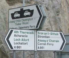 Place names in their original Gaelic are becoming increasingly common on road
signs throughout the Scottish Highlands.
Bilingual signs are used in Wales. Welsh highway authorities choose whether
they are "English-priority" or "Welsh-priority" and the language having priority
in the highway authority's area appears first on signs. Most of south Wales is
English-priority while north Wales is Welsh-priority. Bilingual signing in Wales
and elsewhere has caused traffic engineers to inquire into the safety
ramifications of providing sign legend in multiple languages. As a result some
countries, like New Zealand, have opted to limit the use of bilingual signing.
In the
Scottish Highlands, road signs often are found with the Scottish Gaelic given (in green) as well as the English (in black).
The Netherlands
Road signs in The Netherlands follow the Vienna Convention. Directional signs
(which have not been harmonised under the Convention) always use blue as the
background colour. The destinations on the sign are typically printed in white.
If the destination is not a town (but an area within town or some other kind of
attraction), that destination will be printed in black on a separate white
background within the otherwise blue sign.
The Netherlands always signpost European road numbers where applicable (i.e.
on the
advance directional signs, the ID signs and on the reassurance signs). Dutch national road numbers are placed on a rectangle,
with motorways being signposted in white on a red rectangle (as a A xx) and
primary roads in black on a yellow rectangle (as N xx).
Signage intended for bike-riders always goes on white signs with red or blue
letters.
The Dutch typeface, known as ANWB-Ee, is based on the US typeface. A new
font, named ANWB-Uu (also known as Redesign), has been developed in 1997 and
appears on many recent Dutch signs. The language of the signs is typically
Dutch, even though bilingual signage may be used, when the information is
relevant for tourists.
Finland and Sweden
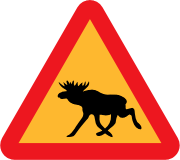 Swedish moose/elk warning sign
The road signs in Finland and Sweden are similar and mostly follow the Vienna
Convention with a few adaptations, however allowed within the convention:
- the background of warning and prohibitory signs is yellow
- the warning signs of moose and reindeer
- the background of direction signs is blue with white text
- the background of motorway direction signs is green with white text
- when applicable, the language of text is Swedish in Sweden, and either
Finnish, Swedish or both in Finland.
Ireland
Until the partition of
Ireland in 1922 and the independence of Southern Ireland (now the Republic of
Ireland) British standards applied across the island. In 1926 road sign
standards similar to those used in the UK at the time were adopted, albeit with
Irish (Gaelic) type in addition to English. In 1956, road signs in
the south were changed to markedly differ from the UK standard with the adoption
of US-style "diamond" signs for many road hazard warnings (junctions, bends,
railway crossings, traffic lights). Some domestic signs were also invented, such
as the stay-left sign (a black curved arrow pointing to the upper-left, although
these have mostly been replaced by the UK/European 'white arrow on blue disk'
signs), while some other signs are not widely adopted outside Ireland, such as
the no-entry sign (a black arrow pointing ahead in a white circle with a red
slashed circumference).
In January 2005 Ireland adopted metric speed limits. Around 35,000 existing
signs were replaced and a further 23,000 new signs erected bearing the speed
limit in kilometres per hour. To avoid confusion with the old signs, each speed
limit sign now has km/h beneath the numerals.
Central and South America
Road signs in Central and South America vary from country to country. For the
most part, conventions in signage tend to resemble North American signage
conventions more so than European and Asian conventions. For example, warning
signs are typically diamond shaped and yellow rather than triangular and white.
Some variations include the "No Parking" sign, which uses a letter 'E' instead
of 'P' (the
Spanish and Portuguese word for 'Parking' is 'Estacionar'). Notable exceptions include
speed limit signs, which follow the European conventions.
Asia
Singapore
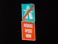 A Singaporean sign asking motorists to slow down
Road signs in
Singapore are all in English, one of the country's four official languages and
the lingua franca of most of the population.
Expressway names are usually in 3 letter contractions such as PIE, for Pan
Island Expressway. Singapore's road signs tend to be similar to those of the
United Kingdom, with triangular warning signs and circular signs as restrictive
signs. The signs usually use the Bureau Grotesque One Seven typeface, with the
exception of street name signs, which have been produced using the Rotis Serif
typeface since August 2001.
Malaysia
Traffic signs in Malaysia used blue signs for federal, state and municipal
roads. Green signs used for toll expressway or highways only. State Road use
letter. Example:Negeri Sembilan <N125>, Melaka <M70>
People's Republic of China
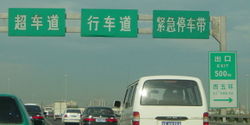 Traffic signs in simplified Chinese and partly in English on Chinese
expressways.
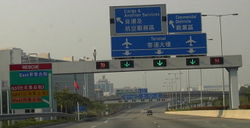 Traffic signs in Hong Kong.
Mainland China uses simplified Chinese characters for its traffic signs. It
is gradually moving toward internationally-accepted signs; it abandoned, for
example, a localised version of the "no parking sign" (with a Hanzi character)
and used the blue-red cross sign as of the late 1990s.
In larger cities and on
expressways of China, both English and Chinese are used.
Hong Kong Special Administrative Region
Although the
mainland uses simplified Chinese characters, traditional Chinese characters are
still used in Hong Kong (as the policy of "one country, two systems" allows Hong Kong to maintain most affairs, including
road traffic regulations, the way they were prior to the handover).
Most, if not all, of Hong Kong's signs are bilingual, as English and Chinese
are considered official languages. English often appears on top of text in
traditional Chinese.
India
 Sign probibiting overtaking
Bureau of Indian Standards (former Indian Standards Institution) is the
standardization body for traffic signs in India. But the standardization is not
always followed on all types of roads in India. Generally the national highways
and the state highways do carry the standardized signboards. Warning and
prohibition signs are circular with a red border on white background. The symbol
is black. The directional markings (of places) are done with white letters on
green background.
India too has its share of peculiar and exotic signboards. For example in
cities its not unusual to spot a signboard prohibiting the entry of bullock
carts to certain lanes.
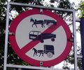 Sign probibiting the entry of trucks, bullock and horse carts
Similarly there are sets of signage at the highways and roads crossing
through forest areas cautioning the drivers of the wildlife. The signboards use
English language.
 Sign board at a road passing through a forest. The road cuts through a habitat
of monkeys
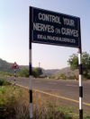 A rather humorous sign board advising drivers to control speed at a curve
Africa
South Africa
South Africa has well developed standards for road signs. Triangular signs
are used for warnings and circular signs are used for prohibitions. In the 1990s the colours
of these signs were changed from white-on-blue with a red border to
black-on-white with a red border. Some regulatory signs that enforce the
direction of traffic flow, or minimum speed limits are white on blue.
Informational signs are rectangular and white on green on normal roads and
white on blue on freeways. The information on these signs is usually in English,
and sometimes in Afrikaans. Other informational signs, such as those that name rivers and towns are white,
while tourist information signs are white on brown.
See also
External links
Home | Up | Traffic code | Driving | Driving on the left or right | Speed limit | Traffic lights | Car safety | Traffic signs
Car Show, made by MultiMedia | Free content and software
This guide is licensed under the GNU
Free Documentation License. It uses material from the Wikipedia.
|


